library(tidyverse)
library(mapview)
library(sf)
library(viridis)
library(RColorBrewer)
sf_use_s2(FALSE)Redlining in Minneapolis and St. Paul
ggplot
MSCS 164: Data Science 1
Investigating Historical Redlining in Minneasota with Mary Hendrickson and Karra Howles
Historically, redlining has had a prominent impact on the city of Minneapolis. Housing in Minneapolis and its suburbs today are still segregated by neighborhood and municipality, impacting school districts, leading to segregated schools. We are interested in finding if redlining has an impact on the resources allocated to the public schools, specifically looking at resources including staffing, teacher salaries, educational attainment, and graduation rates.
Beginning in the 1910s, tens of thousands of racial covenants first started being included in a property’s deed in Minneapolis. A racial covenant is the language included in a property’s deed prohibiting any person of color from buying or living in the property. [^(Sommer, 2020)] Due to this inequity among many other injustices, Minneapolis has some of the largest racial wealth gaps in the United States. Even today, those neighborhoods where racial covenants were included in the property deeds are still mostly white.
The impacts of redlining are seen today through health disparities, wealth gaps, housing insecurity, residential segregation and property values. Residential segregation impacts the enrollment to schools, and property taxes fund the schools [^“Redlining and Neighborhood Health”]. Neighborhoods with lower property taxes often have schools with less resources and funding, where neighborhoods with higher property taxes often have schools with more resources and funding. This project is looking at resources allocated to Minneapolis and St. Paul public schools, in Hennepin, Ramsey, and Dakota counties.
Data We Used
# Mapping Inequality Data
# Link: https://dsl.richmond.edu/panorama/redlining/data

msp_holc = st_read("https://raw.githubusercontent.com/elisefeld/elise_data_dump/main/mappinginequality.json") %>% #Read in data
  filter(state == "MN" &
        (city == "Minneapolis" |
        city == "St. Paul")) %>% #Filter for Minneapolis and St. Paul
  st_transform(4326) %>%
  st_as_sf()
Reading layer `mappinginequality' from data source
`https://raw.githubusercontent.com/elisefeld/elise_data_dump/main/mappinginequality.json'
using driver `GeoJSON'
Simple feature collection with 10154 features and 11 fields
Geometry type: MULTIPOLYGON
Dimension: XY
Bounding box: xmin: -122.7675 ymin: 25.70537 xmax: -69.60044 ymax: 48.2473
Geodetic CRS: WGS 84# Education Data
# Link: https://educationdata.urban.org/documentation/#direct_access
msp_schools <- read.csv("https://raw.githubusercontent.com/elisefeld/elise_data_dump/main/EducationDataPortal_05.01.2024_Schools.csv") %>%
select(-year, -ncessch, -state_location, -bureau_indian_education, -gleaid, -school_id, -leaid, -geocode_accuracy, -geocode_accuracy_detailed, -state_leaid, -state_fips_geo, -seasch, -county_fips_geo, -puma, -state_mailing, -census_region, -census_division, -csa, -cbsa, -phone, -fips, -cbsa_type, -cbsa_city, -city_mailing) %>% #Remove unnecessary columns
filter((city_location == "MINNEAPOLIS"|
city_location == "NORTH SAINT PAUL"|
city_location == "WEST SAINT PAUL"|
city_location == "SAINT PAUL"|
city_location == "SAINT PAUL PARK"|
city_location == "SOUTH SAINT PAUL") & #Filter for Minneapolis and St. Paul
school_status == "Open") %>% # Filter for open schools only
drop_na(c(geo_longitude, geo_latitude)) %>%
st_as_sf(coords = c("geo_longitude","geo_latitude"),
crs = st_crs(4326))
pip <- st_join(msp_schools, msp_holc, join = st_within)
#Turn Column "School Level" into factor and reorder
pip$school_level <- as.factor(pip$school_level)
pip$school_level <- fct_collapse(pip$school_level,
Elementary = c("Prekindergarten", "Primary"),
Middle = c("Middle"),
High = c("High", "Secondary"),
Other = c("Other"))
pip$school_level <- fct_relevel(pip$school_level, "High", "Middle", "Elementary", "Other")
#Summary Statistics for Salaries of Teachers Per Grade
mosaic::favstats(salaries_teachers ~ grade, data = pip) grade min Q1 median Q3 max mean sd n missing
1 A 467297 1366965 1970146 2895196 6235242 2295896 1497834.8 12 5
2 B 25675 1152387 1727862 2486169 8016135 2158596 1732105.3 49 30
3 C 44013 676000 1365883 2274458 4944074 1620509 1145169.1 53 25
4 D 7702 264977 826044 1649816 4250729 1016528 857425.7 37 31# Convert teacher salary from numeric into factor with $1,500,000 increments
pip <- within(pip, {
salaries_teachers_cat <- NA
salaries_teachers_cat[salaries_teachers < 1500000] <- "$0 - $1,500,000"
salaries_teachers_cat[salaries_teachers >= 1500000 & salaries_teachers < 3000000] <- "$1,500,000 - $3,000,000"
salaries_teachers_cat[salaries_teachers >= 3000000 & salaries_teachers < 4500000] <- "$3,000,000 - $4,500,000"
salaries_teachers_cat[salaries_teachers >= 4500000 & salaries_teachers < 6000000] <- "$4,500,000 - $6,000,000"
salaries_teachers_cat[salaries_teachers >= 600000 & salaries_teachers < 7500000] <- "$6,000,000 - $7,500,000"
salaries_teachers_cat[salaries_teachers >= 9000000] <- "$7,500,000 - $9,000,000"
} )Graphs
In 1935, the Home Owners Loan Corporation created maps to determine the level of security for real estate investments, ranging from best, still desirable, definatly declining, and hazardous. The grades were based on housing quality, sale and rent history, and the racial and ethnic identity of the area.
We first obtained data regarding teachers’ grades, salaries, school names, enrollments, among many other variables from the Education Data Portal at the Urban Institute, where we filtered for just school districts in Hennepin, Ramsey, and Dakota counties. After importing this data into R, first we looked at the number of schools per grade in Minneapolis and St. Paul. Our graph tells us that we have data for a greater number of schools in “still desirable,” “defiantly declining,” and “hazardous” categories than we do for the “best” category.
Number of Schools Per Grade in Minneapolis and St. Paul
#count number of schools per grade
schools_per_grade <- pip |>
  group_by(grade) |>
  summarise(school_name_count = n_distinct(school_name))

#Barplot created
ggplot(schools_per_grade, aes(x = grade, y = school_name_count, fill = grade)) +
  geom_bar(stat='identity') +
  guides(fill="none") +
  labs(title = "Number of Schools per Grade in Minneapolis and St. Paul",
       x = "Grade",
       y = "Number of Schools") +
  scale_fill_viridis_d(option = "plasma", na.value = "grey50") +
  theme_bw()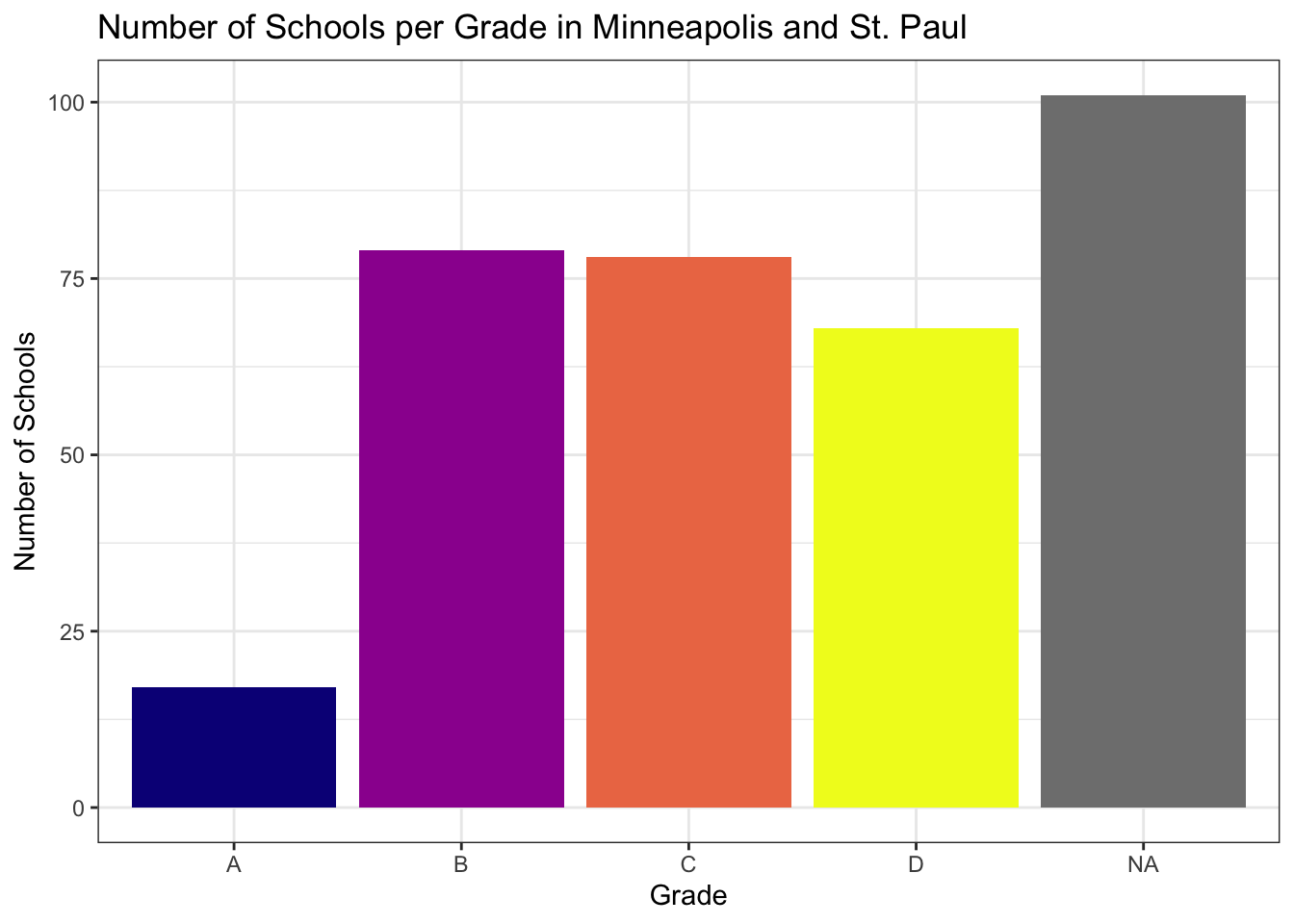
# y-axis is number of schools and x-axis is gradeAlt-text for graph:
This is a bar graph and illustrates the number of schools in Minneapolis and St. Paul for each grade. Grade (A, B, C, D, or NA) is on the x-axis and number of schools is on the y-axis. The variable number of schools ranges from 0 to 100. The appearance of the graph tells us that there is a larger amount of schools in areas graded B, C, and D (around 75) than there are schools in grade A. In addition, there are more NAs or unknown data than there is data for any one grade, which is also interesting to note.
Teacher Salaries By Grade in Hennepin, Ramsey, and Dakota Counties
Next, we created a bar graph illustrating the average teacher salaries in schools for each grade (A, B, C, or D), in addition to a map displaying each grade with information about teacher salary and each school. Below you can see both the map and bar graph:
pip %>%
  filter(grade != "NA" & salaries_teachers_cat != "NA") %>%
    ggplot(aes(fill=salaries_teachers_cat, y=grade)) +
      geom_bar() +
      scale_fill_viridis(option = "plasma", discrete = TRUE) +
      labs(title = "Teacher Salaries By Grade in Hennepin, Ramsey, and Dakota Counties",
           x = "Count",
           y = "Investment Security Grade",
           fill = "Teacher Salaries") +
  theme_bw()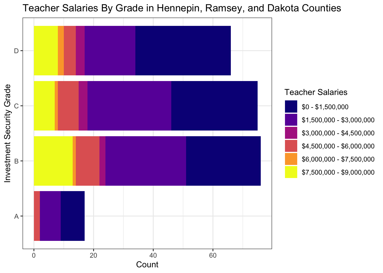
Alt-text for graph:
This is a stacked barplot, which shows a distribution of teacher salaries within each grade. It is titled “Teacher Salaries By Grade in Hennepin, Ramsey, and Dakota Counties,” with a key indicating six colors representing different ranges of teacher salaries for each bar. Teacher salaries range from $7,500,000 to $9,000,000, $6,000,000 to $7,500,000, $4,500,000 to $6,000,000, $3,000,000 to $4,500,000, $1,500,000 to $3,000,000, and $0 to $1,500,000. The x-axis represents the variable count and the y-axis displays the variable investment security grade, which is the level of security for real estate investments created by the Home Owners Loan Corporation. Investment security grade is listed in ascending order, starting with A (“most desirable”) and ending with D (“least desirable). The range of the variable count is from 0 to around 80 for the number of salaries per each grade. Overall, the appearance of the graph tells us that the grades B, C, and D have a very similar distribution of salaries which are in the 0 to $1,500,000 range. However, when you look closer at the data, grade D does have the lowest salary reported ($7702) and the lowest mean salary of all the other grades at $1,016,528. Another part that stands out is that there are only 12 salaries recorded for grade A when compared to about 49, 53, and 37 salaries recorded for the rest of the grades. In grade A, no salaries reached the $7,500,000 - $9,000,000 range, and the highest range is from $4,500,000 to $6,000,000.
pal <- colorRampPalette(brewer.pal(9, "YlOrRd"))

pip %>%
    select(school_name, lea_name, school_level, school_type, enrollment, title_i_eligible, magnet, virtual, lunch_program, salaries_teachers_cat, grade) %>%
  mapview(zcol = "salaries_teachers_cat", col.regions = pal, layer.name = "Teacher Salaries") +
msp_holc %>%
  select(city, category, grade) %>%
  mapview(zcol = "grade", layer.name = "Grade")
Alt-text for map:
This is an interactive map, which illustrates where each grade (A, B, C, and D) are located on a map of Minneapolis and St. Paul. It also displays teacher salaries for each school. Each grade is represented by a block or square-like shape that is either purple (A), blue (B), green (C), yellow (D), and gray (for NA). Each dot on the map represents a specific school, the color of the dot representing salary ranges from $7,500,000 to $9,000,000, $6,000,000 to $7,500,000, $4,500,000 to $6,000,000, $3,000,000 to $4,500,000, $1,500,000 to $3,000,000, $0 to $1,500,000, and NA values. When you click on an area of a specific grade, you can view the city, category, grade, and geometry information. When you interact with a specific dot on the map, you can view information about the school_name, district, school level, school type, amount of students enrolled, lunch programs, teacher salaries, and grade level. Ultimately, the appearance of the map tells us that there are fewer A grades overall in the map of Minneapolis and St. Paul. Neighborhoods like Southwest are classified as A, Longfellow is for the most part categorized as B, Phillips as C, and Sumner-Glenwood as D. Teacher salaries are also lowest on average for neighborhoods in grade D.
Interpreting Map
While this map contains a lot of useful and detailed information, it may also initially feel overwhelming. We started to find patterns within the data displayed on the map, including the fact that on average, neighborhoods categorized as grade A had higher teacher salaries when compared to other grade levels. We also calculated some summary statistics included at the end of our “Data We Used” section to help further interpret the teacher salary data for each grade. Our findings showed us that grade A’s mean salary was still the highest out of all the other grades, while the mean teacher’s salary for grade D was the lowest overall. Teachers’ mean salary for grade A was $2,295,896, grade B’s mean salary was $2,158,596, grade C’s mean salary $1,620,509, and the mean salary for grade D was $1,016,528.
School Enrollment by Grade
pip |>
  filter(grade != "NA" & school_level != "Other") |>
  ggplot(aes(enrollment, fill = school_level)) +
  geom_boxplot(alpha = 0.7) +
  facet_wrap(~category) +
  labs(title = "School Enrollment by Grade",
       x = "Enrollment",
       fill = "School Level") +
  scale_fill_viridis(option = "plasma", discrete = TRUE) +
  theme_bw() +
  coord_flip()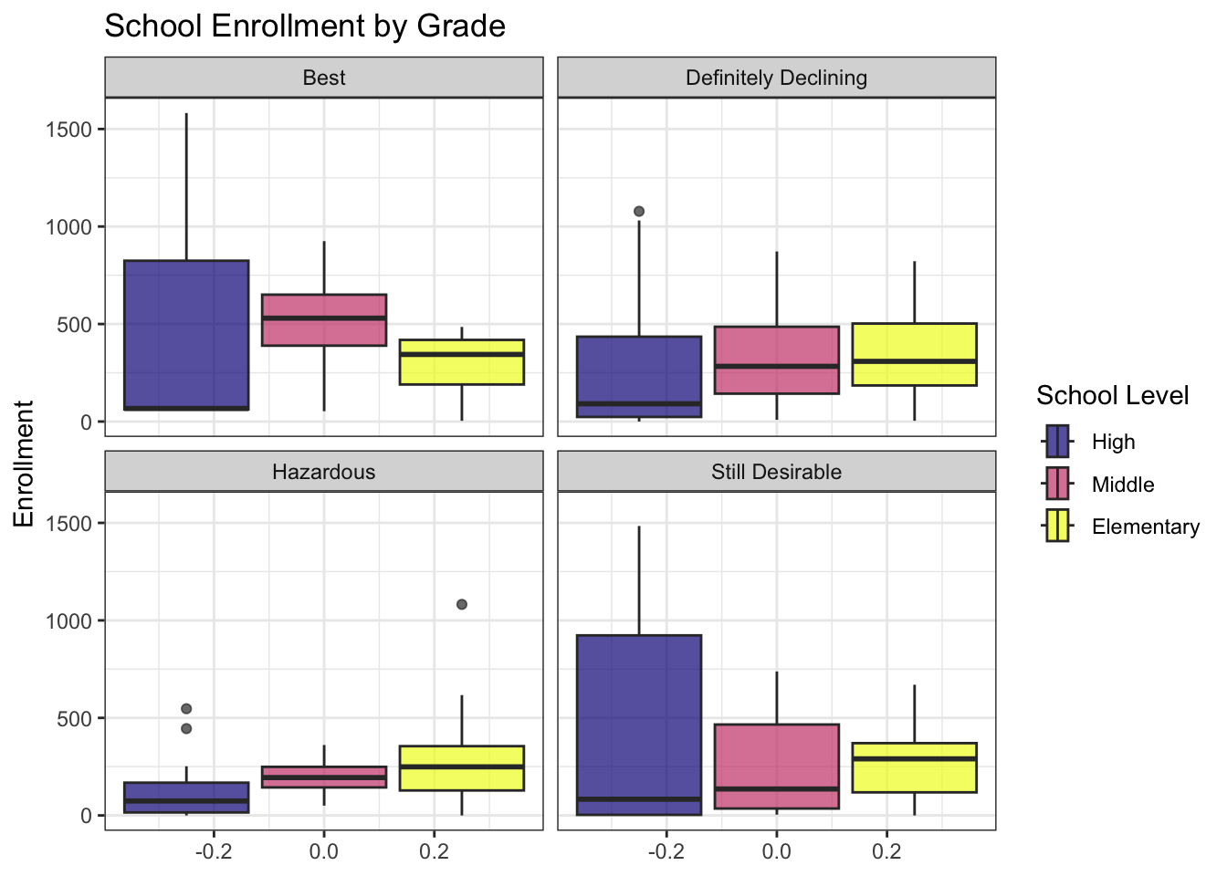
Alt-text for School Enrollment by Grade bar plot This is a bar plot describing school enrollment across security grades, with enrollment ranging from 0 to 1500. All school levels remain fairly stable across grades, with elementary school having around 250 students, middle school ranging from 200 to around 500, and high schools having an an average of around 150 across the categories. High school in “best” and “still desirable” have the most variation, ranging from around 100 to around 950.
Full Time Social Workers by Grade
pip |>
  filter(grade != "NA" & school_level != "Other") |>
  ggplot(aes(social_workers_fte, fill = school_level)) +
  geom_boxplot(alpha = 0.7) +
  facet_wrap(~category) +
  labs(title = "Full Time Social Workers by Grade",
       x = "Social Workers FTE",
       fill = "School Level") +
  scale_fill_viridis(option = "plasma", discrete = TRUE) +
  theme_bw() +
  coord_flip()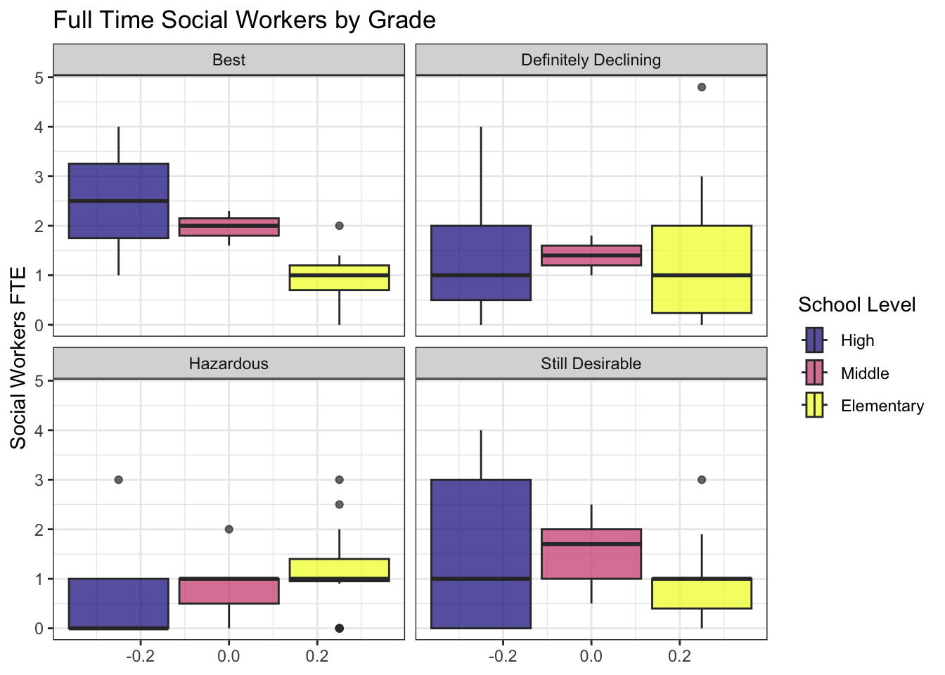
Alt-text for Full Time Social Workers by Grade boxplot: This is a box plot showing full time social workers by grade for each school level, with full time social working ranging from 0 to 5. For the elementary school level, the average number of social workers across the grades is one. The average number of social workers for middle schools begin to vary more, with the “best” category having an average of two full time social workers, around one and a half for “still desireable” and “defiantly declining”. For high schools, there is more variation for the amount of full time social workers, with the ranges of social workers being larger per grade. “Best” had the highest average of two and a half full time social workers, “still desirable” and defiantly declining” having an average of one full time social worker. High schools in the “hazardous” category having the lowest average number of full time social workers at zero.
Full Time Support Staff by Grade
pip |>
  filter(grade != "NA" & school_level != "Other") |>
  ggplot(aes(support_fte, fill = school_level)) +
  geom_boxplot(alpha = 0.7) +
  facet_wrap(~category) +
  labs(title = "Full Time Support Staff by Grade",
       x = "Support Staff FTE",
       fill = "School Level") +
  scale_fill_viridis(option = "plasma", discrete = TRUE) +
  theme_bw() +
  coord_flip()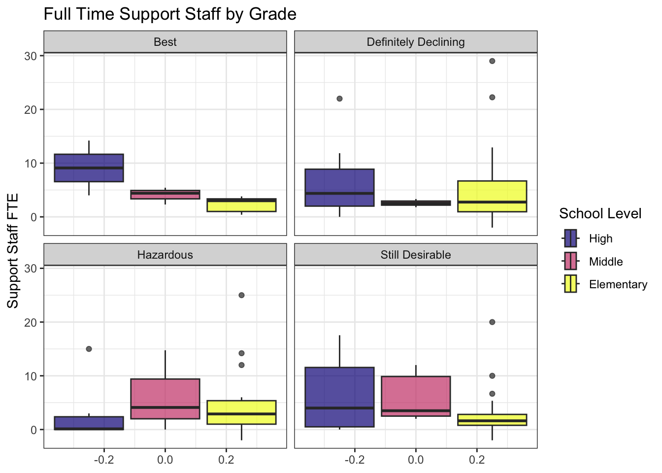
Alt-text for Full Time Support Staff by Grade boxplot This is a box plot showing full time support staff by grade, with support staff ranging from 0 to 30. There are about the same number of full time support staff for elementary schools, about three or four full time support staff across the grades. Elementary schools also had the most outliers, with outliers in the “still desirable,” “defiantly declining,” and “hazardous” categories. Full time support staff for middle schools in all grades remain relatively consistent across grades. Support staff for high school shows some difference across grades, with around eight full time support staff in the “best” category, around four for “still desirable” and “defiantly declining” categories. The “hazardous” category has the lowest average number of full time support staff with an average of zero.
Full Time Counselors by Grade
pip |>
  filter(grade != "NA" & school_level != "Other") |>
  ggplot(aes(counselors_fte, fill = fct_rev(school_level))) +
  geom_boxplot(alpha = 0.7) +
  facet_wrap(~category) +
  labs(title = "Full Time Counselors by Grade",
       x = "Counselors FTE",
       fill = "School Level") +
  scale_fill_viridis(option = "plasma", discrete = TRUE) +
  theme_bw() +
  coord_flip()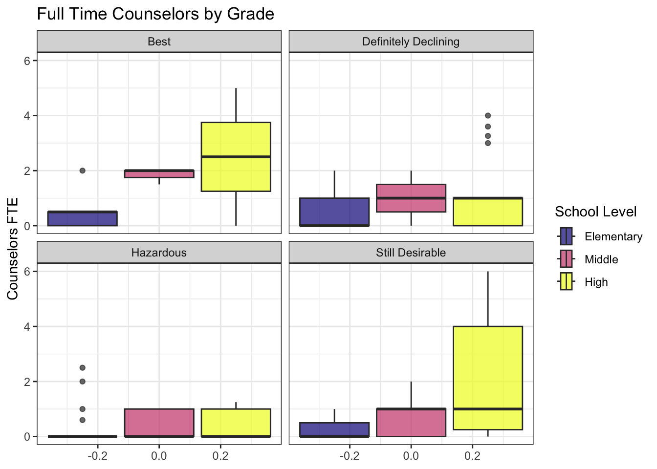
Alt-text for Full Time Counselors by Grade boxplot This is a box plot showing the number of full time counselors by grade, with number of counselors rnaging from 0 to 6. Elementary schools are the most stable across the grades, with the lowest number of full time counselors compared to middle and high schools, with an average of one or zero full time counselors. Middle schools show a slight difference in number of full time counselors, with an average of two full time counselors in the “best” category. The number of full time counselors for middle and high school grades were similar, with an average of one for “still desirable” and “definitely declining.” There is an average of zero full time counselors in the “hazardous” grade for both middle and high schools. The highest average number of full time counselors is 2.5, in the “best” grade at the high school level.
Conclusion
Ultimately, the data we used does not show redlining to have much of an impact on resources allocated or salaries, but that doesn’t mean that there are no impacts of redlining in Minneapolis Public Schools. For example, school districts in Sumner-Glenwood, grade D, generally all had teacher salaries ranging from $0 to $3,000,000, which was lower when compared to other school districts in different grade areas. However, because the count we have is for total salaries of all teachers then we don’t know if it is because they have more teachers (and therefore the total amount they are paying is more). But most importantly we can’t make a conclusion about individual salaries. In addition, because the data is limited and due to several NA values, we can’t make any significant statistical claims that these grades have impacted teacher salaries when only looking at the data we analyzed.
When examining data on school enrollment, full time social workers, full time support staff, and full time counselors by grade, we found some surprising results. We expected that schools in the “hazardous” areas would have less support staff or social workers, yet the numbers were very close for many of them, although the “hazardous” category did tend to have lower numbers.
We found that in high schools, the number of support staff in the “hazardous” category was on average less (0) than the number of counselors in “best,” “still desirable,” and “definitely declining”. “Best” had a higher average number of support staff (10), though because the number of total support staff was very small across all the grades, the difference is small. However, it does display how gaps begin to be noticeable in numbers of support staff or other resources across areas with different grades. This especially becomes noticeable when comparing data from elementary school to high school.
We can’t come to a conclusion based on the data we used as we didn’t complete our statistical analysis, along with having a limited data set.
In searching for data to use, we encountered several challenges, links to public data were either broken or unavailable to use, especially concerning data in recent years. The difficulty getting data from Minneapolis Public Schools is slightly concerning, considering the strike in 2022 and major budget cuts in 2024. The fact that there is not a lot of public access to data or several missing data entries might possibly indicate that schools are covering up data that they do not want to share, specifically regarding information about schools, graduation rates, salary rates, and how they differ geographically and by grade.
Sources
https://educationdata.urban.org/data-explorer/explorer
https://mnatlas.org/resources/graded-neighborhoods-by-home-owners-loan-corporation/
https://public.education.mn.gov/MDEAnalytics/DataTopic.jsp?TOPICID=545
https://www.nytimes.com/2021/11/27/us/minneapolis-school-integration.html
https://www.axios.com/2024/05/14/school-segregation-brown-eudcation-ruling-70th
https://tcf.org/content/report/school-integration-america-looks-like-today/
[^(Sommer, 2020)]: This citation was from the article “Minneapolis Has A Bold Plan To Tackle Racial Inequity. Now It Has To Follow Through” written by Lauren Sommer (https://www.npr.org/2020/06/18/877460056/minneapolis-has-a-bold-plan-to-tackle-racial-inequity-now-it-has-to-follow-throu).
[^“Redlining and Neighborhood Health”]: This citation was from the article “Redlining and Neighborhood Health” by Jason Richardson, Bruce C. Mitchell, Helen C.S. Meier, Emily Lynch, and Jad Edlebi (https://ncrc.org/holc-health/).